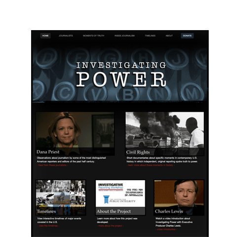
Investigating Power is an online, multimedia presentation that examines the life and work of some of the most important national journalists since 1950. The project goal was to create a website featuring videos, journalist biographies, career highlights, and interactive historical timelines.
Client
Charles Lewis, Executive Editor, Investigative Reporting Workshop
Individual | Author | Nonprofit Organization | University
Audience & Topics
General Audience
Journalism | U.S. History | Newspapers | Mass Media | Politics
Launched
March 2012
Project Accolades
Roles, Deliverables and Methods
Information Architect
Sitemap and Page Layouts
Interface Designer (UI/UX)
Design Comps
Lead Developer
Production Website with Content Management System
Webmaster
Functional Enhancements and Major Content Additions (as needed)
Technology & Tools
Features

HD Video and Photography
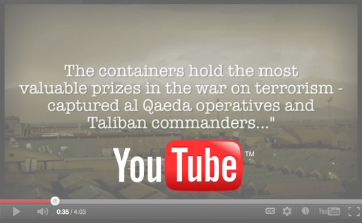
The website features 50+ HD videos, as well as photographic stills taken from those videos and historical archives. To keep the site's bandwidth usage low and to ensure the greatest compatibility across technologies (browsers, devices), the videos are served via YouTube using a jQuery modal (pop-up) plugin with custom branding. The majority of the video thumbnails are also served directly from the project's YouTube channel to increase load times and decrease maintenance burdens.
Interactive Timelines
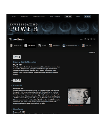
The website features five interactive, historical timelines powered by jQuery and CSS. Visitors are presented a visual depiction of the major historical events around topics such as Civil Rights, Vietnam, and Watergate. Where appropriate, events include embedded, relevant videos from the site. The original code for the site was later enhanced and became what is now known as the Timeliner jQuery plugin.
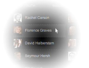
Mega Menus
Ensuring that users easily and quickly see as much of the website's offerings as possible — 26 featured journalists and 7 featured topics — was a core information architecture and design challenge. One solution is the site's custom-designed "mega menus" that show users at a glance what is available. The menus use a combination of Twitter's Bootstrap CSS, a dash of jQuery for a subtle animation effect, and image sprites to achieve the desired outcome.
Built for Speed
The site's code is optimized — minified, combined and compressed — to provide fast page loads. In addition, videos and images are hosted on YouTube's content distribution network (CDN). The end result is a speedy site that earns an "A" grade and 97 out of 100 on Yahoo's YSlow performance analyzer.
Content Management
The website is powered by the CMSense content management system, a lightweight and highly flexible CMS. This allows for 95% or more of the site's content to be maintained without developer assistance. If necessary, larger-scale modifications (e.g., new templates) can be added in short order.
Branded Sharing Icons
We did away with the standard Facebook, Twitter, and Google+ buttons. Instead, the site employs a small set of custom icons that don't sacrifice its design. They're built on top of the AddThis API and help promote sharing of the website.
