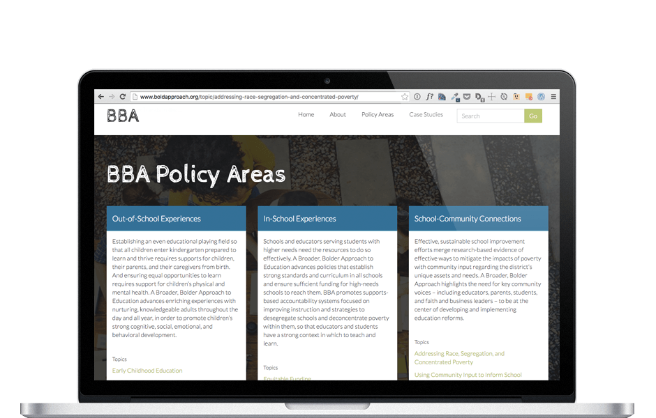
The Broader Bolder Approach to Education (BBA) is a national campaign that proposes evidence-based policies to improve schools and remedy conditions that limit many children's readiness to learn. We created a brand as well as a website for BBA in 2011. Five years later, they brought us on to help re-frame the website around new content and a new look. In March of 2016, we launched their re-designed and re-developed WordPress website.
Client
Economic Policy Institute, Washington DC
Nonprofit Organization | Think Tank
Audience & Topics
Policy Advocates, Policymakers, Government and Education Administrators
Education | Public Policy | Poverty | School Reform | Educators
Launched
March 2016
Roles, Deliverables and Methods
Information Architect
Requirements Gathering, Content Review, New Information Architecture and HTML Prototypes
Interface Designer (UI/UX)
Updated Branding and Front-end Design
Lead Developers
Production Website with WordPress CMS
Webmaster
Functional Enhancements and Major Content Additions (as needed)
Technology & Tools
From Concept to Launch
Although BBA already had a website, one that we designed and developed in 2011, they were shifting gears. They had developed new content and hoped to engage their audience in new ways. They wanted to ensure that the new content was front and center, and presented in a way that was easy to find and use for their audience. Case studies and online learning modules (MOOCs) were new additions. Further, they wanted to re-think their previous policy topic pages to make them easier to digest.
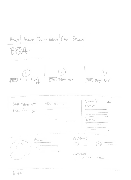
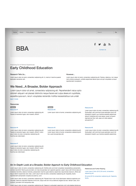
After requirements gathering and internal sketch work, our technical work for this project involved creating several HTML prototypes. Our prototypes are live web pages that help clients see our proposed page layouts and content organization schemes. They help bring to life things like navigation schemes, carousels and other visual components that are hard to understand in traditional flat wireframe documents.
We built several prototypes to represent their most critical new pages including the new homepage, policy areas landing page and a single policy area page. After several rapid iteration cycles, we were able to launch a vanilla version of their site ready for a complete aesthetic treatment. Our new treatment drew on our original branding work, but modernized and refreshed the overall look and feel through new imagery and artwork, updated typography, new user interface element treatments (e.g., buttons) and more.
Our development work brought all of our information architecture and design work together under the easy to use WordPress CMS. Using a combination of custom post types, custom fields and custom taxonomies, we provided BBA with an easy to manage and maintain website, one for which they will rarely need to seek outside developer support.
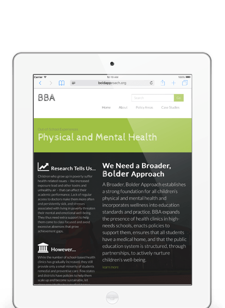
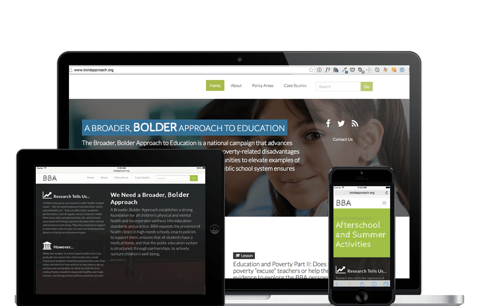
End users now have a beautiful new website, one that is responsive and works fully on a variety of devices. The mobile smart phone version is optimized at advanced levels to minimize download times and further improve search engine rank and placement.
