task Responsive Mobile and Tablet Versions of 120 Days Movie Website
2013-10-17
It's an unfortunate truth that some projects don't come to fruition as fast as I might hope. Despite enthusiasm on all sides--from the client, from me and everyone else involved--some projects just take a long time to get launched for a variety of reasons outside of my control. Case in point, the website that I did for the 120 Days movie project, a new documentary film by Ted Roach. The website was started and completed nearly two years ago, long before the release of the film. Only recently was it decided to launch the website as the film is set for release at its world premier at the 2013 Austin Film Festival.
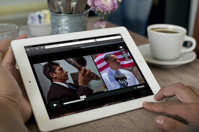
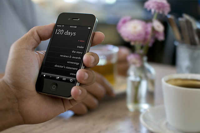
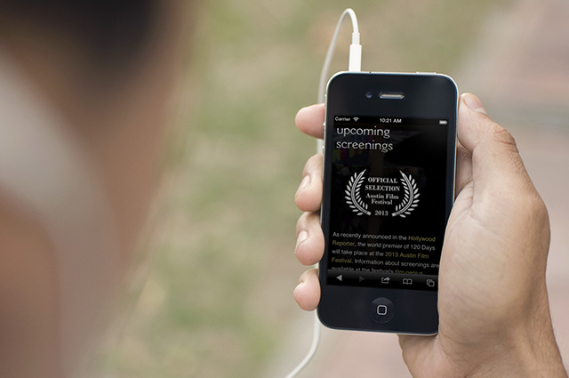
In some worlds that might not be a big deal, but in the web world, two years might as well be twenty. Design trends change fast and technology changes even faster. For the 120 Days website, the glaring issue to me was the fact that I didn't develop the site with a responsive framework, so the tablet and mobile versions left much to be desired. And today, after pulling up the site on my phone, I just couldn't bear it anymore...
So I put on some headphones and "responsified" the site, greatly optimizing it for mobile phones and tablets (say iPad). It wasn't a particularly fun task--retrofitting is far more difficult than starting off with a responsive framework. Plus, because of some of the multimedia elements of the site (HTML5 audio), I had to write some creative javascript to get iOS and the iPad to cooperate. All in all, I'll feel better any time I'm on the site--hopefully others will have a better experience too.